


Critics unimpressed by town’s new logo
Bruce Sinclair, local democracy reporter
A new ‘brand’ and logo to “help promote and unite” Pembrokeshire’s county town has been called “embarrassing” and a waste of money.
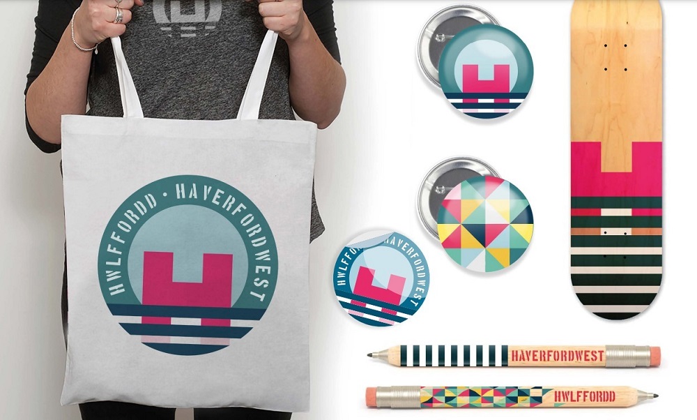
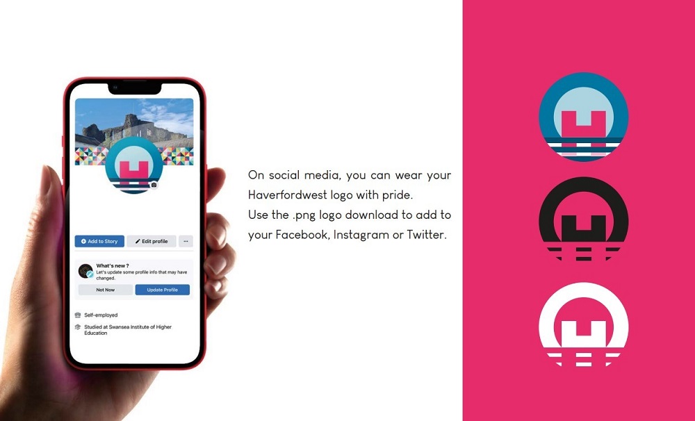
The stylised new Haverfordwest branding features an H – representing the town’s castle – set in two circles with lines at the bottom representing the Cleddau River.
Pembrokeshire County Council has said: “Haverfordwest is enjoying a time of significant investment, which will bring attention and people to the town.
“This new visual brand identity toolkit has been created to help promote and unite Haverfordwest. It positions this great county town in its rightful place at the heart of Pembrokeshire.”
Accompanying the brand launch is a ‘toolkit’ for businesses and local projects, with logos, fonts and colours that are part of the identity branding.
A 24-page booklet of identity guidelines has also been produced, which shows both colour and monochrome versions of the logo, together with branded items like bags.
Research
It reads: “In our research we were told that the ‘best’ things about Haverfordwest are (in order): the river, the central (Pembrokeshire) location, the castle, the friendly people, the independent shops, the history and heritage.
“We needed to find a way of weaving these together into an easy-to recognise identity that communicates ‘The Heart of Pembrokeshire’.
“The colour palette references Haverfordwest’s natural and built environment. The main colours are inspired by the river, the tiles unearthed from the Friarage excavations, and iconic buildings around town.
“We were inspired by Haverfordwest’s heritage to include a pattern that references Haverfordwest’s heritage – from the tiles uncovered during the excavations to Georgian hallways.”
Pembrokeshire County Council has previously said the cost has been met through grant funding elements of projects taking place, adding: “Haverfordwest has a rich history and an exciting future, with an extensive programme of regeneration work underway at several locations.
“The aim of the brand engagement has been to bring this all together.”
After the logo was shown on social media, support has been muted to say the least, with one person saying it looked like a hospital sign.
One respondent said: “That’s awful….kids in college could do better its embarrassing!”
Another said: “Very underwhelming to say the least! We need to put on more events so people can enjoy our town not spending stupid amounts of money on something that looks like a two-year-old created.”
Other comments included: “Nothing there that relates to the town, nothing of any interest to make you want to know more,” and “Waste of money plain and simply.”
Pembrokeshire County Council has been contacted for a statement.
Support our Nation today
For the price of a cup of coffee a month you can help us create an independent, not-for-profit, national news service for the people of Wales, by the people of Wales.


A “H” with a sinking feeling.
As logos go it is quite stylish. I don’t think a monochrome version would be quite as good. I immediately recognised the H as the castle and the water.
As the sort of logo you put on street signs and council vehicles, it looks good. Yeah something more detailed may appear nicer in many situations. But as a general logo to use universally, it does the job and has a lovely clean look to it.