


Watch: Dragons reveal new name and badge in rebrand from region to club
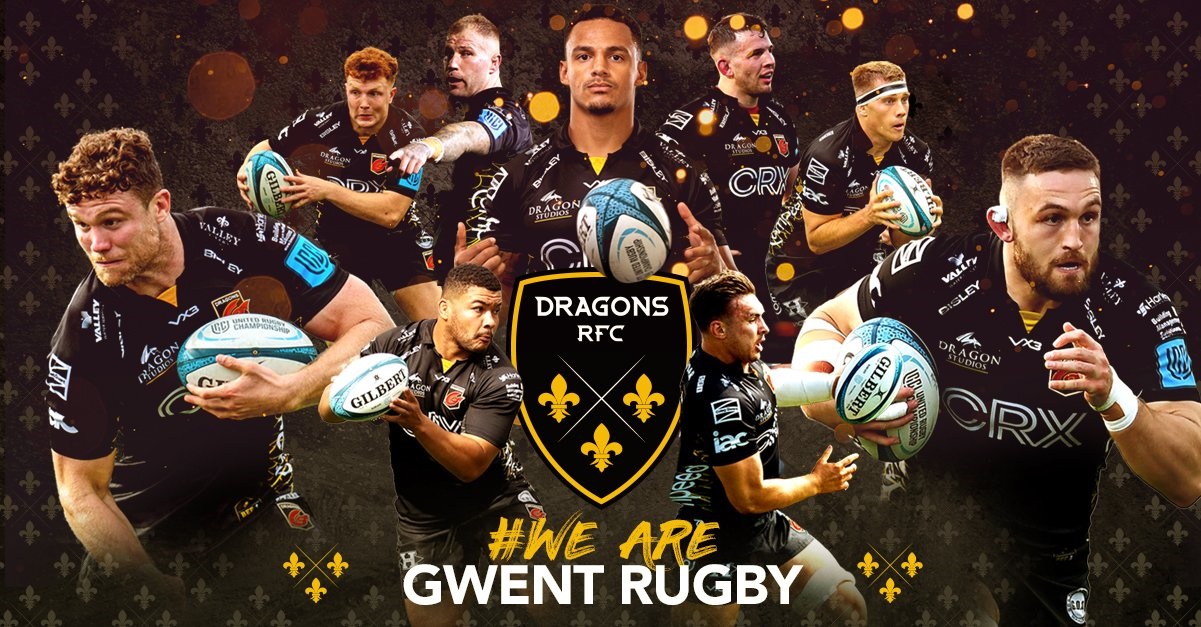
The Newport-based Dragons have announced a rebrand as Dragons RFC.
A new club logo comprises three fleurs-de-lis – symbolic across many crests in the Dragons’ region – with colours of black and amber to represent Newport, plus the blue of Monmouthshire and Gwent.
“Our new name makes it clear – we are a rugby club,” the Dragons said in a statement.
“This is a message we know strikes home with our supporters. We all see ourselves as a club, and we feel strongly about that.
“This does not detract from us representing our region or the people of Gwent. But we are being authentically true to what we have always been, and now our name reflects this.”
🚨𝙒𝙀 𝘼𝙍𝙀 𝙂𝙒𝙀𝙉𝙏 𝙍𝙐𝙂𝘽𝙔…
🐉𝙒𝙀 𝘼𝙍𝙀 𝘿𝙍𝘼𝙂𝙊𝙉𝙎 𝙍𝙁𝘾!!! #BringYourFire🔥 #WeAreGwentRugby pic.twitter.com/yPnuO3OAwQ
— Dragons RFC (@dragonsrugby) June 27, 2022
David Buttress, chairman of the United Rugby Championship outfit, added: “We are excited to welcome in a new era at our great club, and this change comes in the wake of a robust, challenging and honest debate over the past 12 months.
“Opinions and feedback have been canvassed to ensure the club has a brand that feels authentic and true to us.
“This is a new direction for our club. We are not losing our identity, we are evolving and growing.”
Support our Nation today
For the price of a cup of coffee a month you can help us create an independent, not-for-profit, national news service for the people of Wales, by the people of Wales.
Get more trusted Welsh news
Choose Nation.Cymru as a preferred source in Google News to see more of our journalism.


I’m confused. So that’s 2 names and 2 logos? Genius marketing.
Why in the blue hell are the Newport Dragons rebranding with the French Royal crest? They are synonymous with French Royalty and nothing whatsoever to do with whatever area the Newport Dragons are pretending to represent today. And on that note, Superclub “Regional” rugby, since it first went down that awful route, has often tried to abandon the geographical monickers in the hope of drawing in larger crowds than their usual derisory numbers. We ALL know that regions were a stitch-up by Llanelli, Swansea, Cardiff and Newport (having screwed over Bridgend and Pontypridd) Also, what is it with Welsh Rugby… Read more »
The 3 fluers de lise are on the Monmouthshire arms and are said to be based on the arms of the Kingdom of Gwent. K. of Gwent pre-dates K. of France by 300 years. But I suspect that the arms of Gwent were concocted by some romantic herald in the middle ages and weren’t ever really used in the ancient Kingdom.
3 Fleur de lie is the badge of the Bishop of Monmouth ! Diocese founded 1920. Pale Blue & Black are the Monmouthshire heraldic colours ! The feathers are German! Picked off a fallen German knight who was fighting the Black Prince who impressed by the dead knight’s bravery and skill. Took the Heraldic device as ransom for the body instead of the usual gold etc. Considered very chivalric at the time. ( German, Ich Dein = I Serve. The Prince of Wales title was brought back in to service by that Welsh bloke Henry 7th, first Tudor (Ty de… Read more »
Just Newport by another name. Same as before. And they wonder why they don’t get much support from the rest of Gwent! “Regional” rugby was botched from the start, and it has been a failure. The Dragons being so Newport-centric pretty much disenfranchised the thousands of rugby supporters in Gwent who supported other clubs than Newport. And where are they now? Some – like me – still support their clubs like they did before “regional” teams were brought in. Others have been lost to other sports. In my not-so-humble opinion, all the “regions” should be scrapped. The system has failed.… Read more »