The Six Nations has been rebranded – and not everyone is happy

The Northern Hemisphere’s premier rugby competition is a welcome addition to the sporting calendar every New Year and ahead of kick off in the 2025 championship at the end of January, the Six Nations has unveiled a rebrand.
Wales travel to take on France in the opening fixture on Friday, January 31 – the tournament kicking off with a new brand identity.
However, it has been met with fierce criticism from some fans and members of the media alike.
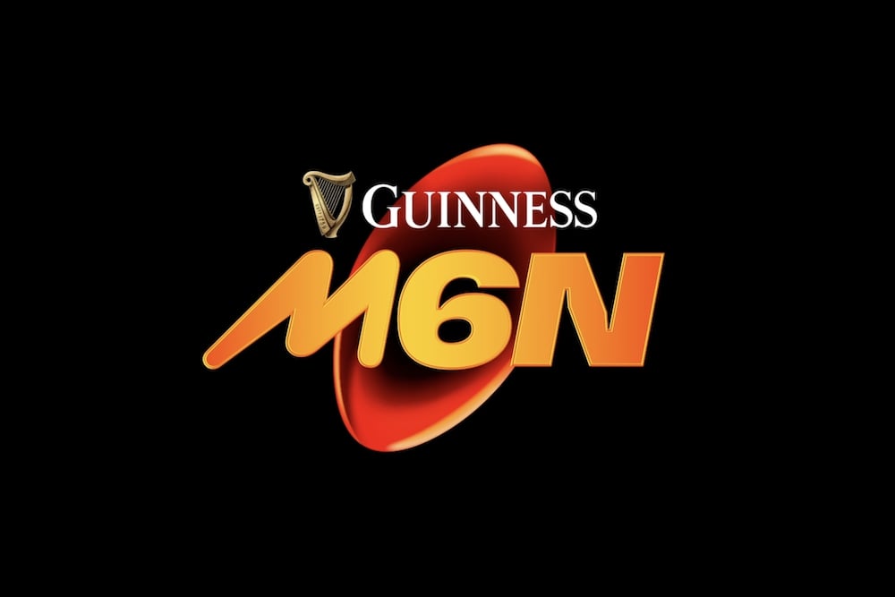
The unveiling of a new logo M6N (Men’s Six Nations) was announced by organisers with a statement on the tournament website – and rugby supporters were quick to have their say.
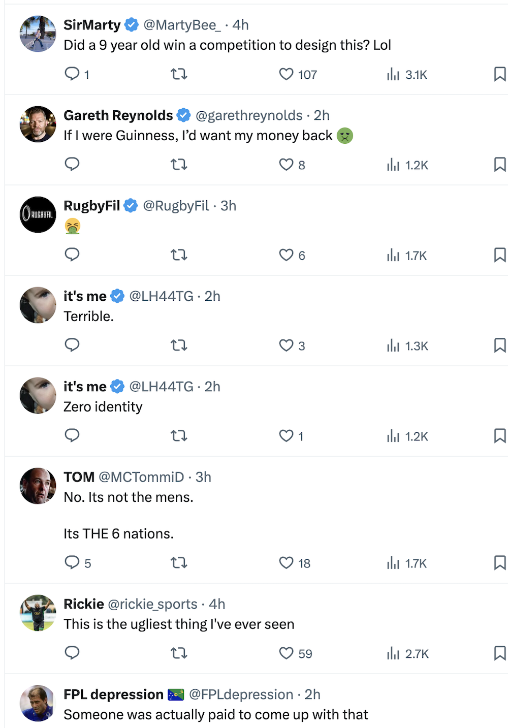
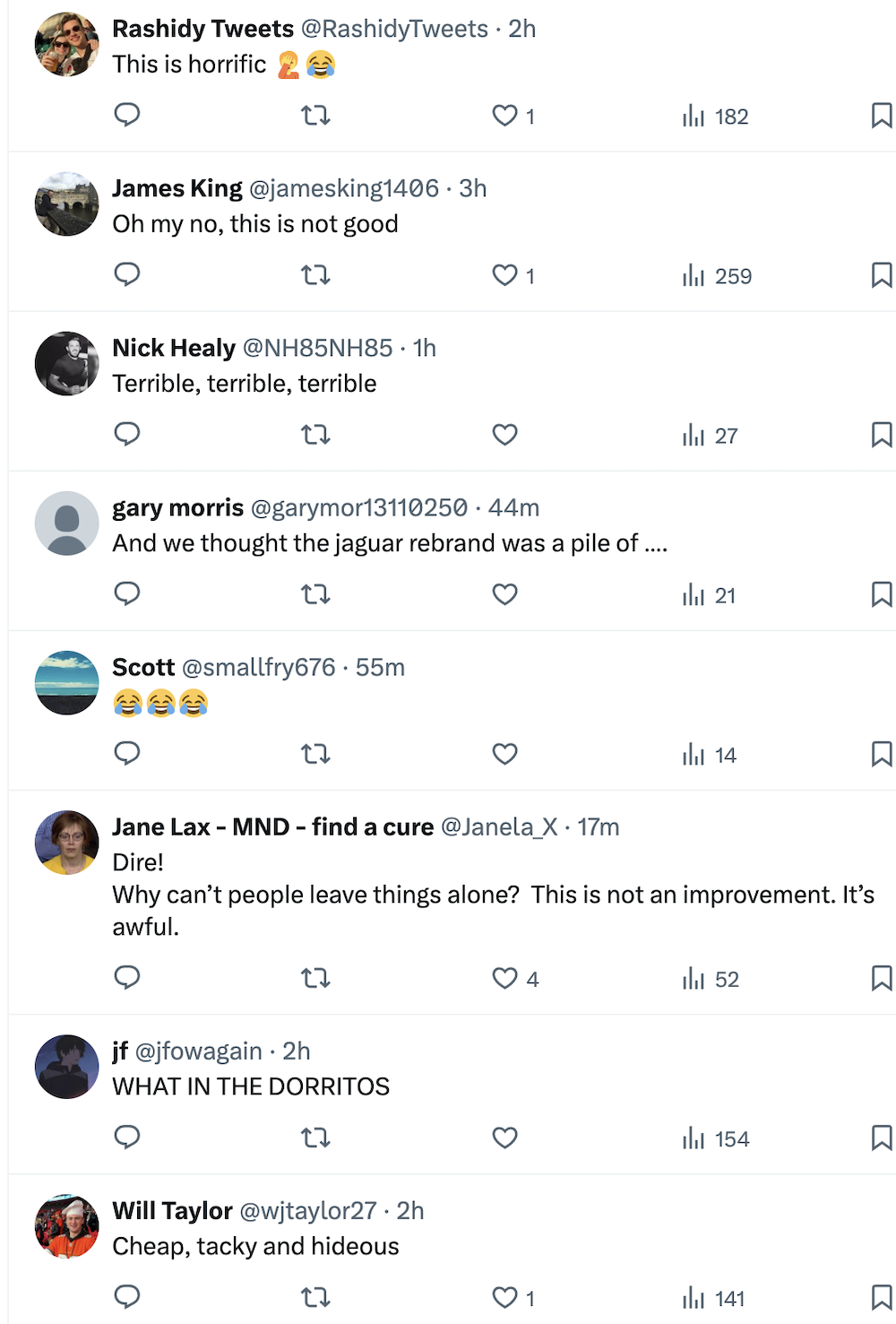
When the logo was posted on social media platform X (formerly Twitter) the comments were distinctly uncomplimentary.
𝙎𝙖𝙢𝙚 𝘾𝙝𝙖𝙢𝙥𝙞𝙤𝙣𝙨𝙝𝙞𝙥, Supercharged New Brand 🔥🟠 #RugbyRecharged #GuinnessM6N pic.twitter.com/3K1ZYkXNhJ
— Guinness Men’s Six Nations (@SixNationsRugby) November 30, 2024
Here are a selection of the comments…


Explaining the idea behind the rebrand on the Six Nations website a statement from organisers read: ‘Connecting its rich heritage with the modern game, and articulated through a distinctive and bold new brand, it is designed to resonate with everyone from new and existing fans to the players and unions competing in this iconic Championship.
‘The rebrand follows extensive research and consultation with fans, target audience members, Unions and Federations, and international rugby players. Six Nations Rugby has created a brand identity that celebrates the heritage of its Men’s Championship, while its bold visual designs reflect today’s game and how fans feel about the sport (and, specifically, the Men’s Six Nations experience). The launch of the M6N identity joins the recent introduction of W6N and U6N brands, creating a consistent and versatile family of brands.
‘The modern brand is defined by its distinctive orange colourway, signifying the optimism fans feel when they get together at the end of winter to experience the Six Nations together.
‘To reach fans and introduce the new brand, Six Nations Rugby, alongside its Unions and Federations, led a social media campaign, alongside in-stadia activation and host broadcaster support, across the final two weeks of the Autumn Nations Series The brand was introduced across Six Nations Rugby social channels following Ireland v Australia in Dublin on Saturday, the final fixture of this year’s Autumn Nations Series.’
The statement continued: ‘More than just reimagining the brand logo of the Guinness Men’s Six Nations, the launch of the new identity is intended to articulate the evolution of the Championship and modern game of rugby. The electrifying action and experiences that fans look forward to and enjoy every year is expressed through the versatile new identity that has been informed by feedback from all corners of the game.
‘Rich in heritage and returning bigger and better reach year, the Guinness Men’s Six Nations is set to celebrate its 25th anniversary, but its roots reach back to 1883, when the Home Nations competition was first founded.
‘It’s the heritage of the Championship that separates it from other forms of entertainment vying for the attention of fans, but a new brand identity offers the opportunity to better engage new fans, excite existing ones, and closes generation gaps.’
Tell us what you think of the rebrand – do you like it or loathe it? Let us know – leave a comment below
Support our Nation today
For the price of a cup of coffee a month you can help us create an independent, not-for-profit, national news service for the people of Wales, by the people of Wales.


Sport and especially rugby by its very nature is sexist, because of the need for power and pace that emphasises the difference between sexes – an honest and not sexist statement. It’s important that anyone has the opportunity to play any sport, but the ‘fans’ demand only the best these days so do not support womens rugby to the extent that it can become a professional sport. ‘Hell hath no fury’, so the English rugby ‘Quentin – Alphonsi’ sabotage report on Cymru rugby used this to its ultimate effect. So now the same is chipping in to a tournament that… Read more »
Its crap. Consultation? What consultation?
They keep saying heritage, but where and how is heritage reflected?
Looks like the wrapper off a well known chocolate bar. So, what is it, smooth milk chocolate on the outside with nugget and toffee on the inside or just full of nuts.
(scurries off for a look see, ah, they rebranded the women’s game logo as well, but the press release is all about the mens game, quelle surprise).
Who were the consultants anyway. Feel a lot of US influence here. Wish they would walk away from twitter as well all things considered.
I should add that is also looks useful for graphics on a screen (unable to play video to see the full bit) but as long as its not too intrusive, its the players I will be watching.
Naff. And the Guinness logo looks like an afterthought
It’s crap! as mentioned by others it’s „The 6 Nations“ not „mmmmmmmmmmmmmmsixnnnnnnnnnn“ I don’t think that they’ve actually asked Rugby Fans, they probably stood outside Man.City/Utd. and ask them what they think, pathetic!
Can’t imagine one single “new fan” being attracted by this. The Six Nations will soon look like the Taylor Swift Tour. An overhyped event with flashing lights and outrageous ticket prices. But at least you’ll be able to purchase the M6N t-shirt for a modest £39.99.
its ok; whats all this up in arms stuff flying around as if this must be really important to people. the quotes above are so OTT for a friggin LOGO…..a LOGO!! please get a life. that said the best comment was “The Six Nations” which i’m happy with
The only good thing about this is the hundreds of comedy comments on its twitter feed. The woke brigade will have to change it anyway as their sabotage report of Cymru last year has now made it The Five Nations, plus the W6N is now only going to mean The Woke Six Nations.
Oh dear an excuse for the mouth-frothers to spew more bile. Who cares? Really? We get the “woke” tag on everything that dinosaurs don’t agree with. We sound like a nation of morons. In truth the logo is rubbish and the new acronym misses the mark, but does it really affect you to the core of your being? If so, I suggest you open the door and go for a walk. You may see a world outside of your echo chamber. All this male bravado nonsense is childish. I’m a fifty-odd year old ex-prop who played when the dark arts… Read more »
Everything has to have a three letter acronym (TLA) these days.